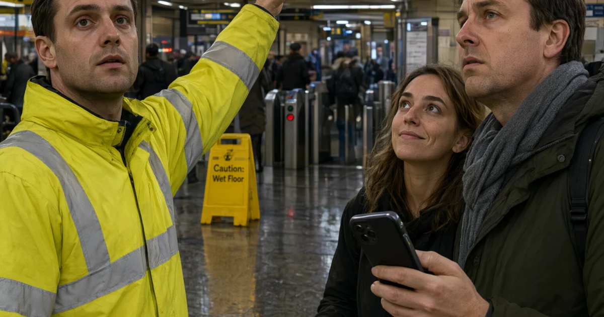
Dense Text Poster Qwen Image 3.0 Pro Prompt is built for tiny labels, packed layouts, and scenes that need real typography. Qwen Image 3.0 Pro handles long prompts better than older versions, which makes it a strong pick for boards, posters, and diagram-like images. The official launch notes are on Qwen Image 3.0, and the upgrade notes in Qwen Image 3.0 vs 2.0 explain why dense visuals are the sweet spot.
Why Dense Text Poster Qwen Image 3.0 Pro Prompt works
Qwen Image 3.0 Pro is useful when a normal image prompt starts to fall apart. It handles long instructions, layered composition, and small text better than simpler image models. That matters for transit boards, flyers, menus, product sheets, and other scenes where the layout carries as much weight as the subject.
The best results came from prompts that stayed specific. Each prompt below names the camera view, the lighting, the text style, the number of people or objects, and the thing that must stay readable. That gave the model enough structure to keep the scene clean instead of turning it into visual noise.
| Example | What it tests | Why it matters |
|---|---|---|
| Transit board | Readable text, people, reflections | Good for hard signage scenes |
| Flyer wall | Dense layout, multilingual copy | Tests small type and paper texture |
| Tea tin infographic | Product layout, labels, steps | Shows how the model handles tidy structure |
Three tested prompts
Each example below was generated on Qwen Image 3.0 Pro at 9:16 and 2K. The first one was used as the cover because it handled the hardest mix of people, hands, lighting, and readable text.
1. Platform board
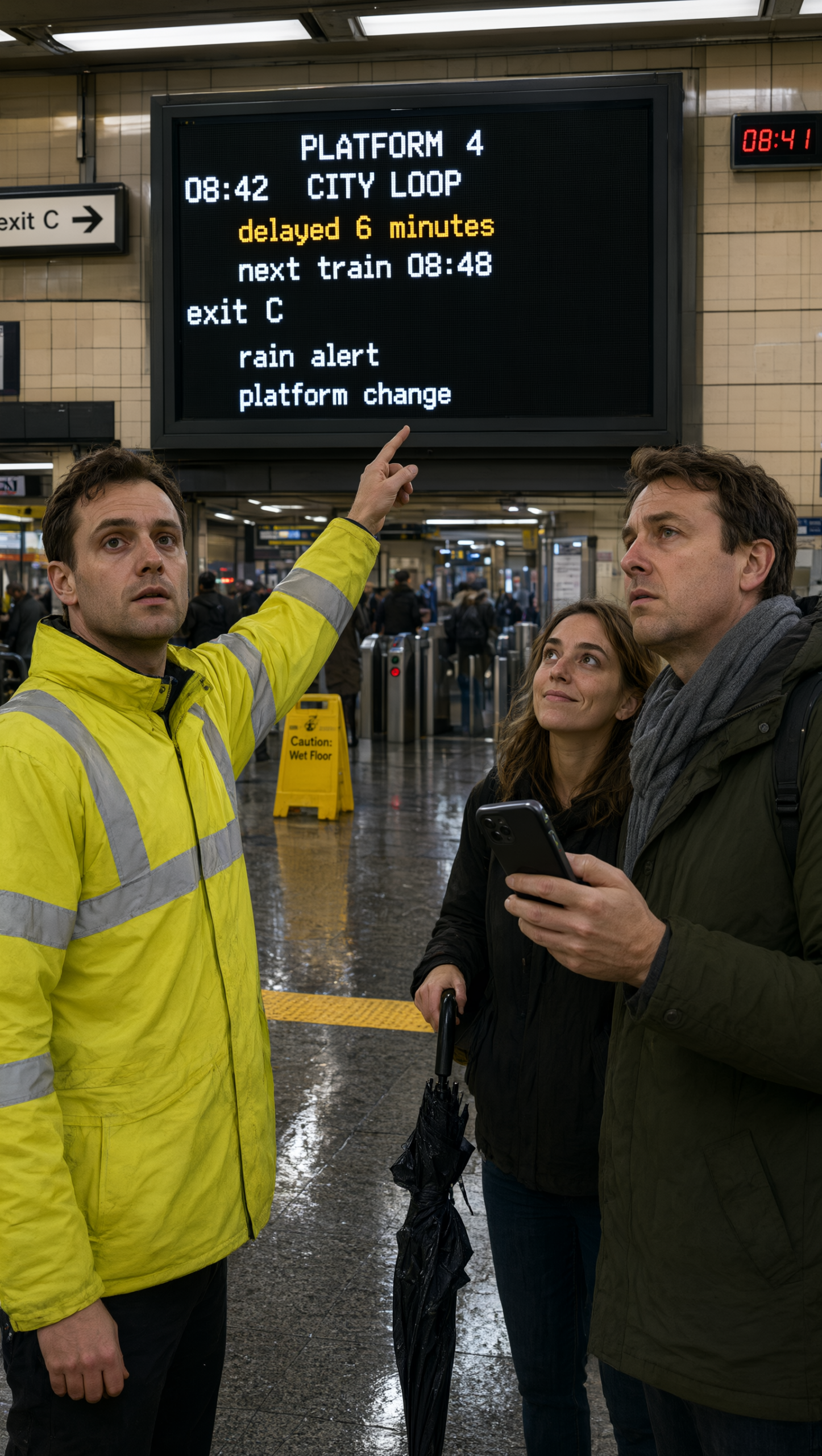
This one pushes the model on signage, crowd detail, and hand placement. It is the best fit when the image needs to look like a real place, not a generic render.
Vertical editorial photo inside a busy subway station. A bright digital departure board fills the background and every line of text is readable: PLATFORM 4, 08:42, CITY LOOP, delayed 6 minutes, next train 08:48, exit C, rain alert, platform change. Foreground: a transit worker in a yellow jacket pointing at the board, two commuters looking up, realistic hands, wet floors, fluorescent light, 35mm lens, crisp focus, natural skin, no logos, no gibberish text.Settings: Qwen Image 3.0 Pro, 9:16, 2K, prompt extend on, thinking on, no input image.
2. Flyer wall
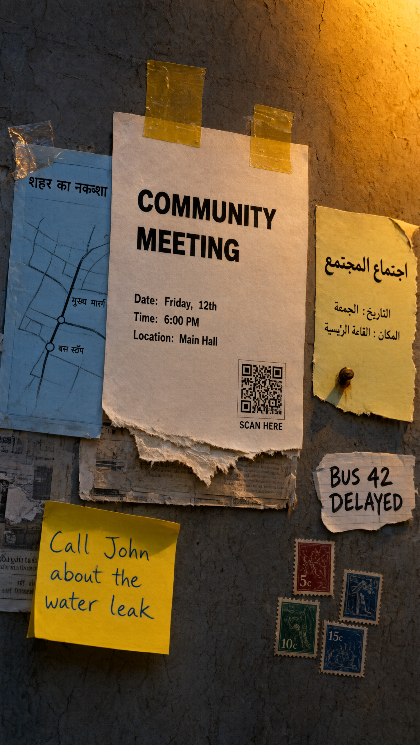
This version shifts the focus from people to layered typography. It works well for walls, notice boards, campaign mockups, and other compositions where the text density is the point.
Straight-on street poster photographed on a wall at dusk. The wall is covered in multilingual flyers, route maps, handwritten notes, and tiny stamps. Include readable text blocks in English, Hindi, and Arabic, a torn paper texture, tape shadows, a small QR code placeholder shape, warm streetlight, documentary realism, no brand names, no gibberish.Settings: Qwen Image 3.0 Pro, 9:16, 2K, prompt extend on, thinking on, no input image.
3. Tea tin infographic
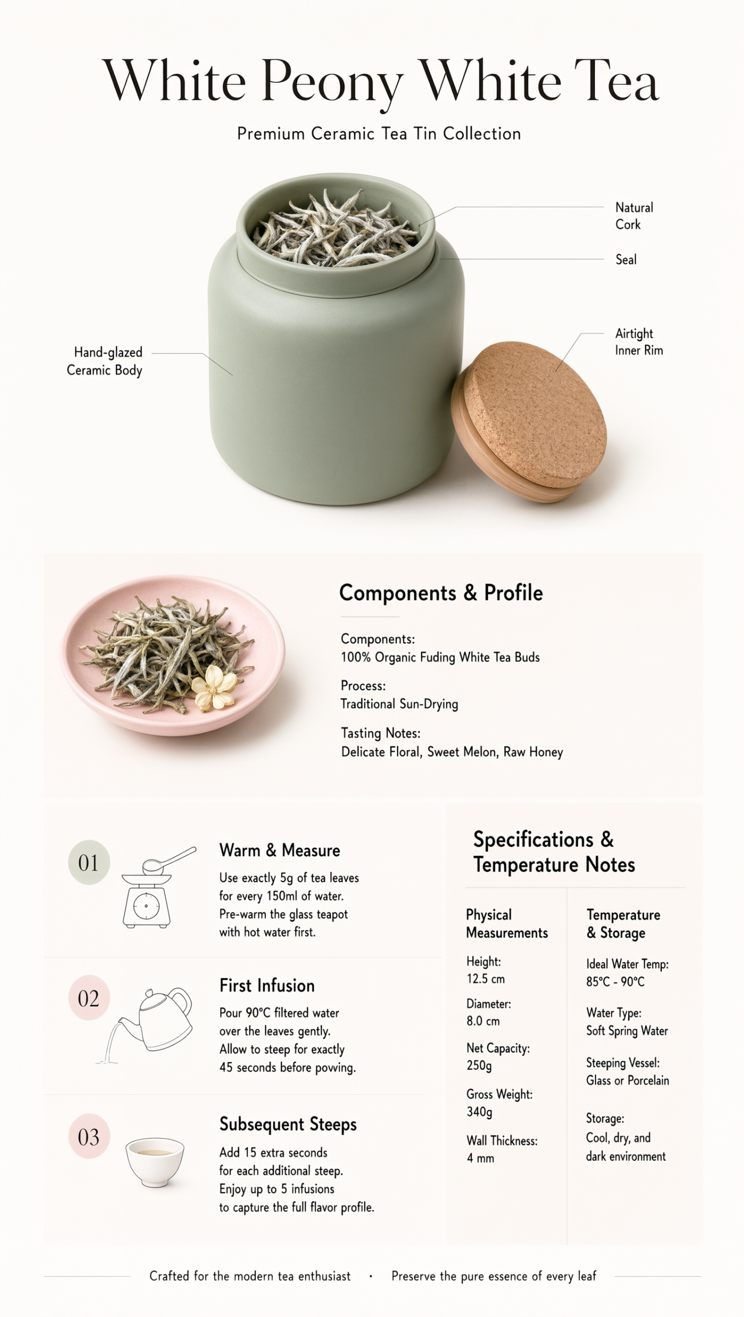
This prompt leans into structured layout. It is useful when the image needs a product feel, a short process, and clean spacing without losing the text.
Studio product infographic for a ceramic tea tin. Show the tin, lid, ingredients, three brewing steps, and a small side panel with measurements and temperature notes. Clean grid layout, tiny readable labels, soft pastel palette, bright studio lighting, subtle paper texture, crisp typography, no logos, no gibberish text.Settings: Qwen Image 3.0 Pro, 9:16, 2K, prompt extend on, thinking on, no input image.
What to tweak next
If the board needs more realism, widen the camera view and cut the number of readable lines. If the layout needs more density, add a second text layer, a tighter grid, or one extra language. If the scene starts to feel crowded, remove one object before adding another. Qwen Image 3.0 Pro seems to do best when the structure stays clear.
- Use 3:2 if the layout needs more horizontal space.
- Swap in a handwritten poster if the scene should feel less polished.
- Ask for exact text only when the words matter.
- Keep one hard constraint in every prompt: readable text, hands, or several objects.
Run this prompt yourself
Every example above was generated on Wiro. Paste the prompt, pick the model, and get your own result.


