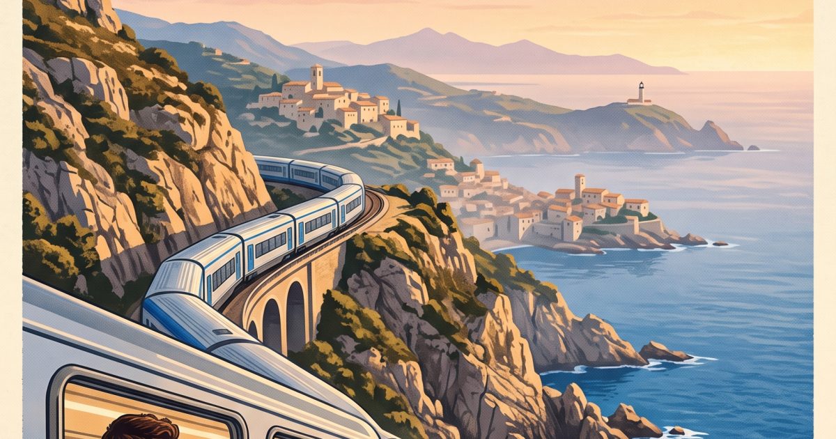
This Cobalt Coast Poster Nano Banana 2 Prompt makes a polished travel campaign image with readable type, a believable train scene, and a strong vertical layout for social posts or mood boards.
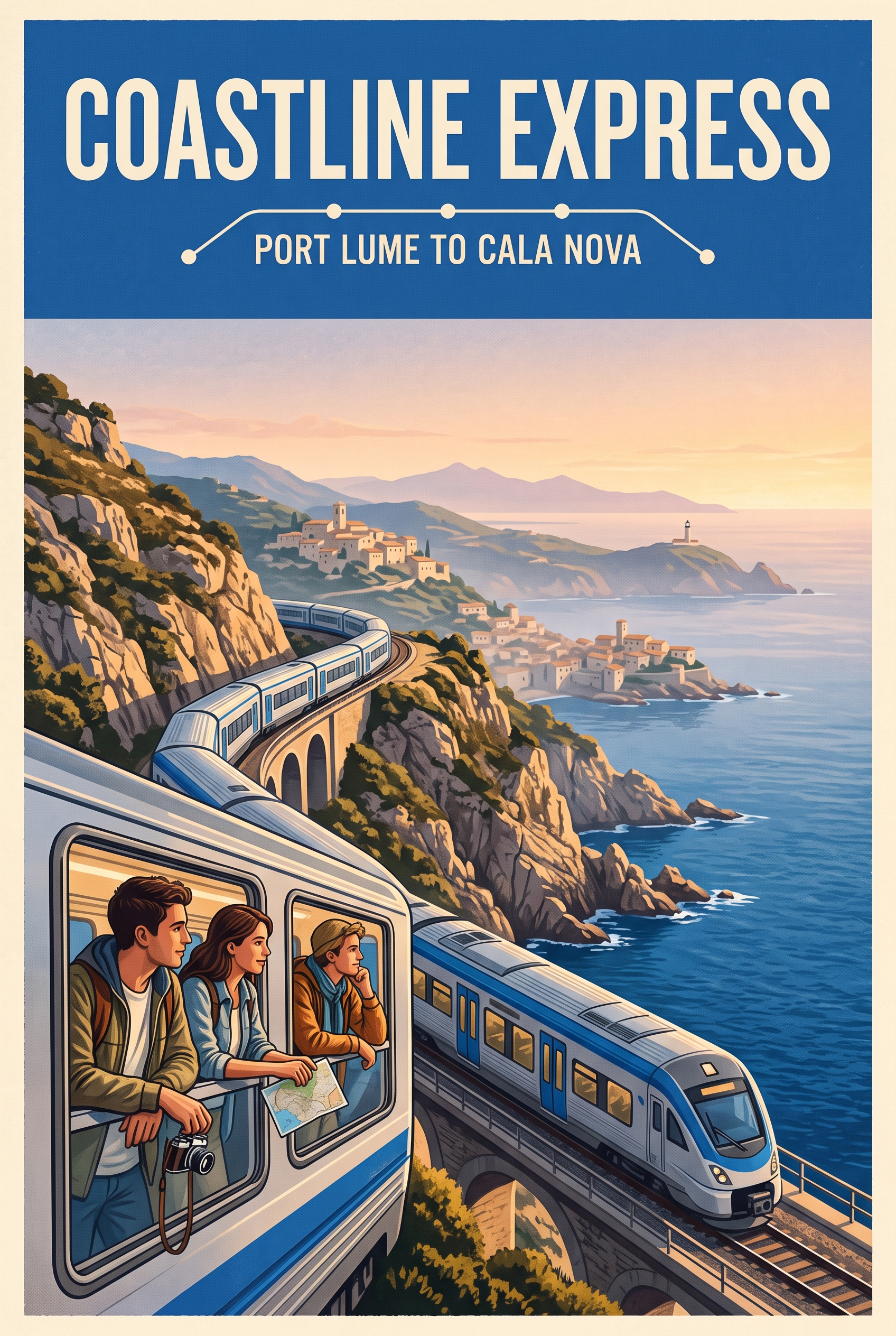
Main cobalt coast poster
A premium editorial travel poster for a fictional cobalt-blue coastal rail route at sunrise. A sleek silver train curves above a Mediterranean cliff, three travelers with believable hands lean by the windows, pale stone villages and sea haze in the distance. Strong graphic composition with a cobalt field across the upper third carrying crisp, perfectly legible cream text: COASTLINE EXPRESS. Add a small route line below: PORT LUME TO CALA NOVA. Screen-print texture, 50mm travel photography, clean edges, vertical 2:3 composition, no logos.Settings: google/nano-banana-2, 2:3 aspect ratio, 2K resolution, safety setting OFF.
The prompt gives the model two jobs that need to agree: sell the journey and preserve a poster-like reading order. The cobalt field solves that problem early. It reserves quiet space for the route name instead of asking text to compete with cliffs, windows, and sea haze. The train then becomes the line that carries the eye through the frame.
Variations
Blue harbor ferry poster
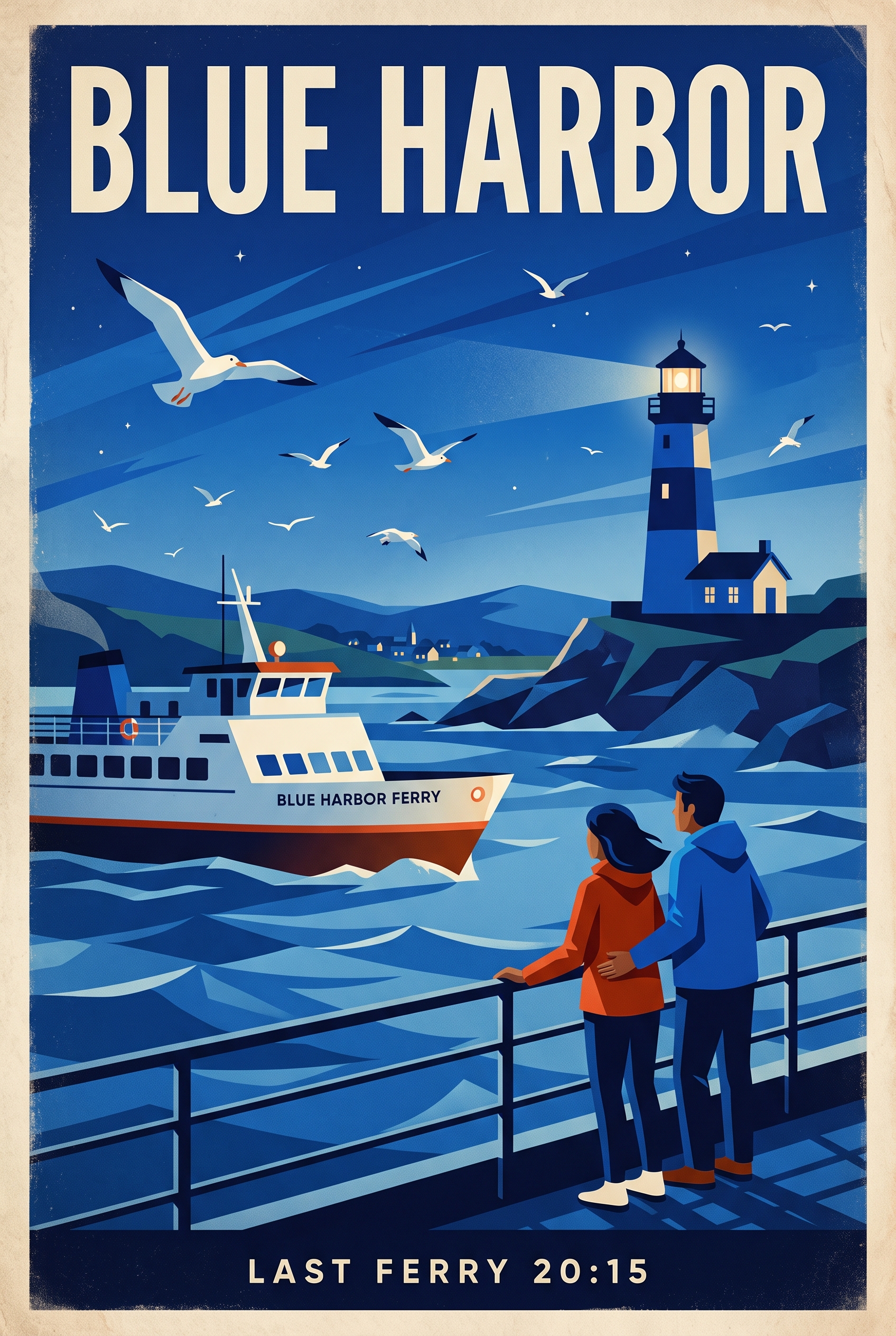
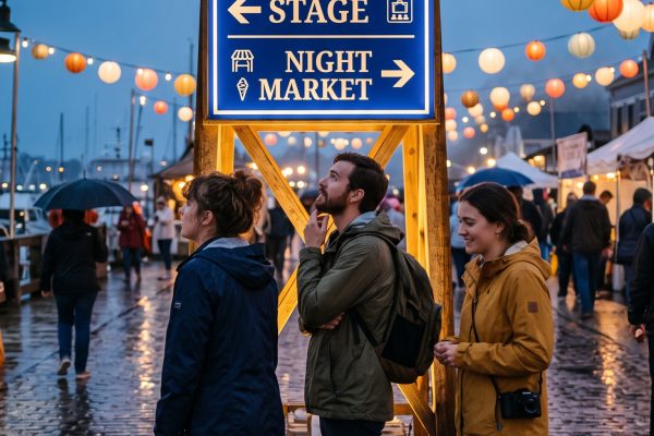
A sun-faded 1970s travel poster for a fictional island ferry crossing at blue hour. A white ferry passes a cobalt lighthouse, two people in windbreakers stand at the rail with natural hands, and gulls cross the sky. Bold geometric shapes, restrained cream and ultramarine palette, subtle paper grain. Put perfectly legible text at the top: BLUE HARBOR. Put small text at the bottom: LAST FERRY 20:15. Vertical 2:3 composition, no logos.Settings: google/nano-banana-2, 2:3 aspect ratio, 2K resolution, safety setting OFF.
Northline winter tram poster
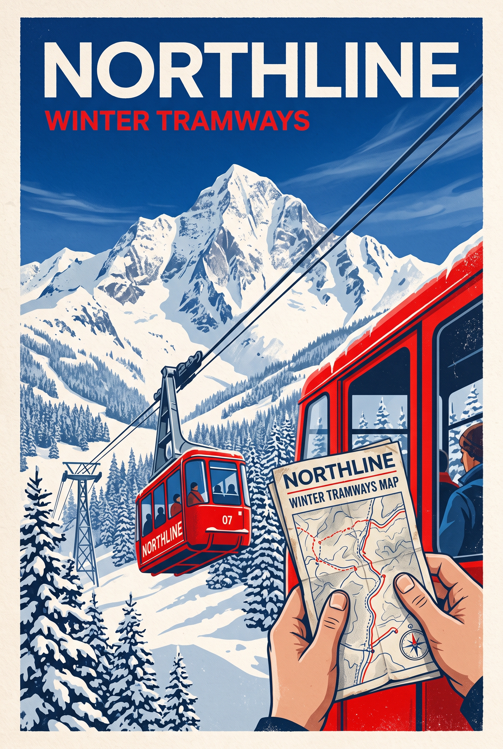
A graphic editorial poster for a fictional mountain tram in winter. A bright red tram climbs through snowy pine trees toward a cobalt sky, one traveler holds a paper map with believable fingers. Use crisp Swiss-style layout, deep blue, red, and warm white, with tactile offset-print grain. Set perfectly legible headline text: NORTHLINE. Set a small subtitle: WINTER TRAMWAYS. Vertical 2:3 composition, no logos.Settings: google/nano-banana-2, 2:3 aspect ratio, 2K resolution, safety setting OFF.
Why this Cobalt Coast Poster Nano Banana 2 Prompt works
- It puts the route name, route detail, placement, and color in separate instructions. That gives the text a defined role.
- It names a single dominant object. The silver train stays readable even with a cliff, village, people, and water in view.
- It uses a limited palette. Cream type has room to separate from the cobalt panel, while the landscape can remain natural.
- It asks for believable hands only where hands matter. That keeps the small human detail useful instead of making it the whole scene.
- It pairs screen-print texture with a photographic lens cue. The result can feel designed without becoming a flat illustration.
For a client-ready image, keep the copy short. A headline plus one route line works better than an itinerary. Make the headline a real place or campaign name only after the composition works. A fictional name is useful during testing because it shows whether the model can maintain letter shapes without relying on a known logo.
Change only one visual system per revision. Swap the train for a ferry, or move from sunrise to blue hour, but retain the text zone and aspect ratio. That makes it easier to see which instruction changed the image. If the lettering drifts, simplify the supporting line before making the scene less detailed.
More Nano Banana 2 prompts
Browse the full Nano Banana 2 Prompts collection for more outputs. For a different take on print-led visual direction, see the GPT Image 2 Prompts category.
More on the model itself: Nano Banana 2 on Google DeepMind.
Run this prompt yourself
Every example above was generated on Wiro. Paste the prompt, pick the model, and get your own result.



3 Comments