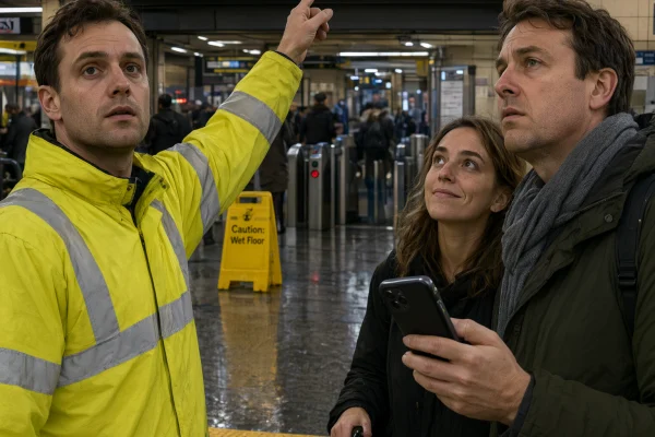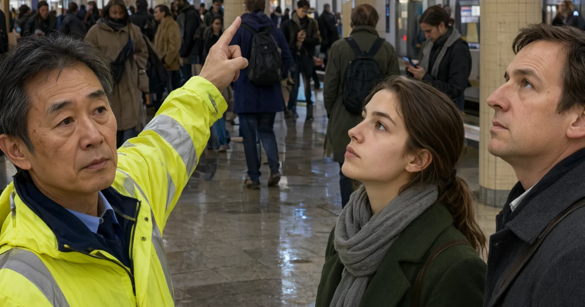
The multilingual transit board Qwen Image 3.0 Pro prompt is built for dense text, tiny labels, and tight layout control. It pushes the model into a lane where many image generators slip: readable information blocks without melted lettering. The model page is Alibaba Qwen Image 3.0 Pro on Wiro, and the samples below keep the prompt practical.
For another layout-heavy example on this site, see Festival Wayfinding Poster Nano Banana 2 Prompt.
Multilingual Transit Board Qwen Image 3.0 Pro Prompt
Prompt: Vertical editorial photo inside a crowded metro station. A bright digital departure board fills the background. Every line of text is perfectly readable: PLATFORM 4, 08:42, CITY LOOP, DELAYED 6 MINUTES, NEXT TRAIN 08:48, EXIT C, RAIN ALERT, PLATFORM CHANGE. Foreground: a transit worker in a yellow jacket pointing at the board and two commuters looking up. Wet floor reflections, fluorescent light, realistic hands, natural skin texture, 35mm lens, sharp focus, no logos, no gibberish text.
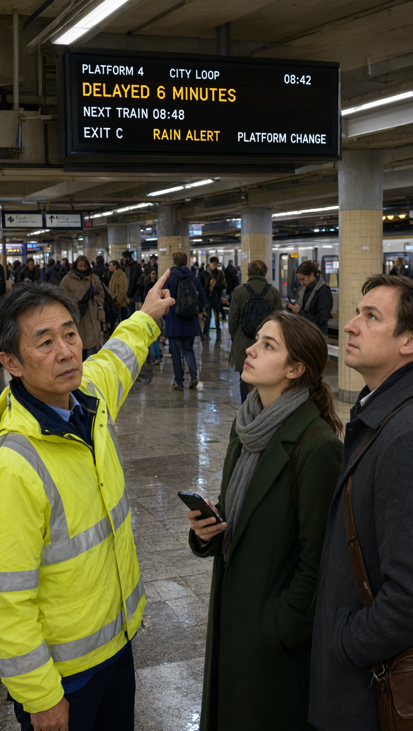
This version works because the board is the subject, not a background prop. The scene also gives the model a clear hierarchy: one display, one worker, two commuters, and a simple lighting setup. That keeps the text readable and the composition clean.
Quick settings for this Qwen Image 3.0 Pro prompt
| Setting | Choice | Why it helps |
|---|---|---|
| Ratio | 9:16 | Fits tall boards, posters, and phone-first sharing. |
| Resolution | 2K | Helps small labels stay crisp. |
| Prompt extend | true | Gives the model more room to respect the layout. |
| Thinking | true | Improves structure without changing the price. |
The main lesson is simple. Qwen Image 3.0 Pro handles structured scenes best when the prompt names the text first, then the people, then the environment. If the order gets fuzzy, the board gets fuzzy too.
Street Poster Wall variation
Prompt: Straight-on street poster wall photographed at dusk. The wall is covered with multilingual flyers, route maps, handwritten notes, and tiny stamps. Include readable text blocks in English, Hindi, and Arabic, clear tape shadows, torn paper texture, warm streetlight, documentary realism, crisp typography, no brand names, no gibberish.
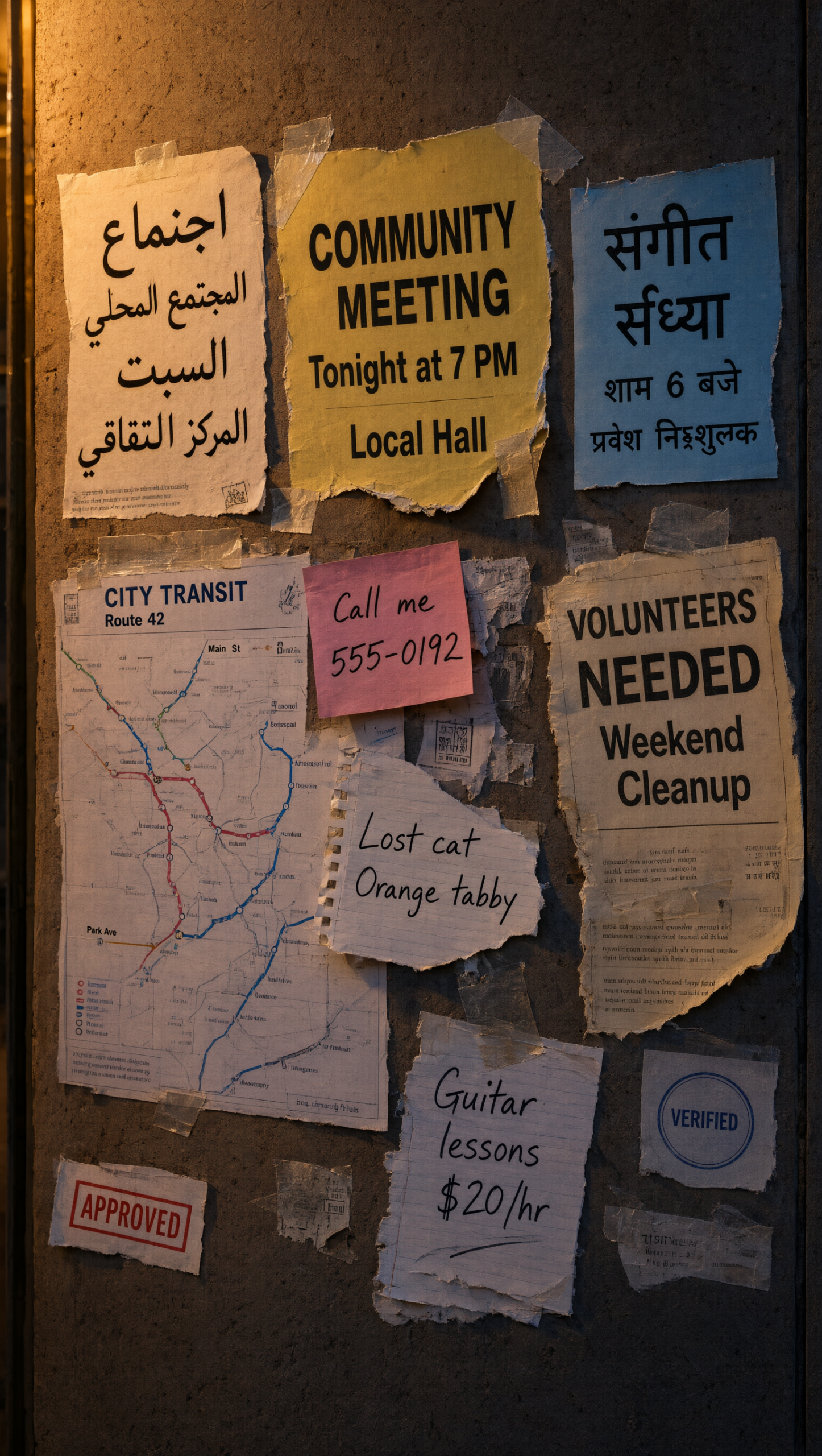
This one adds more texture and more text types. It is a stronger stress test than a clean poster because the torn paper, tape, and handwritten notes all compete for attention. The model still keeps the layout readable when the instruction stays specific.
Tea Tin infographic variation
Prompt: Studio product infographic for a ceramic tea tin. Show the tin, lid, ingredients, three brewing steps, and a small side panel with measurements and temperature notes. Clean grid layout, tiny readable labels, pastel palette, bright studio lighting, subtle paper texture, crisp typography, no logos, no gibberish text.
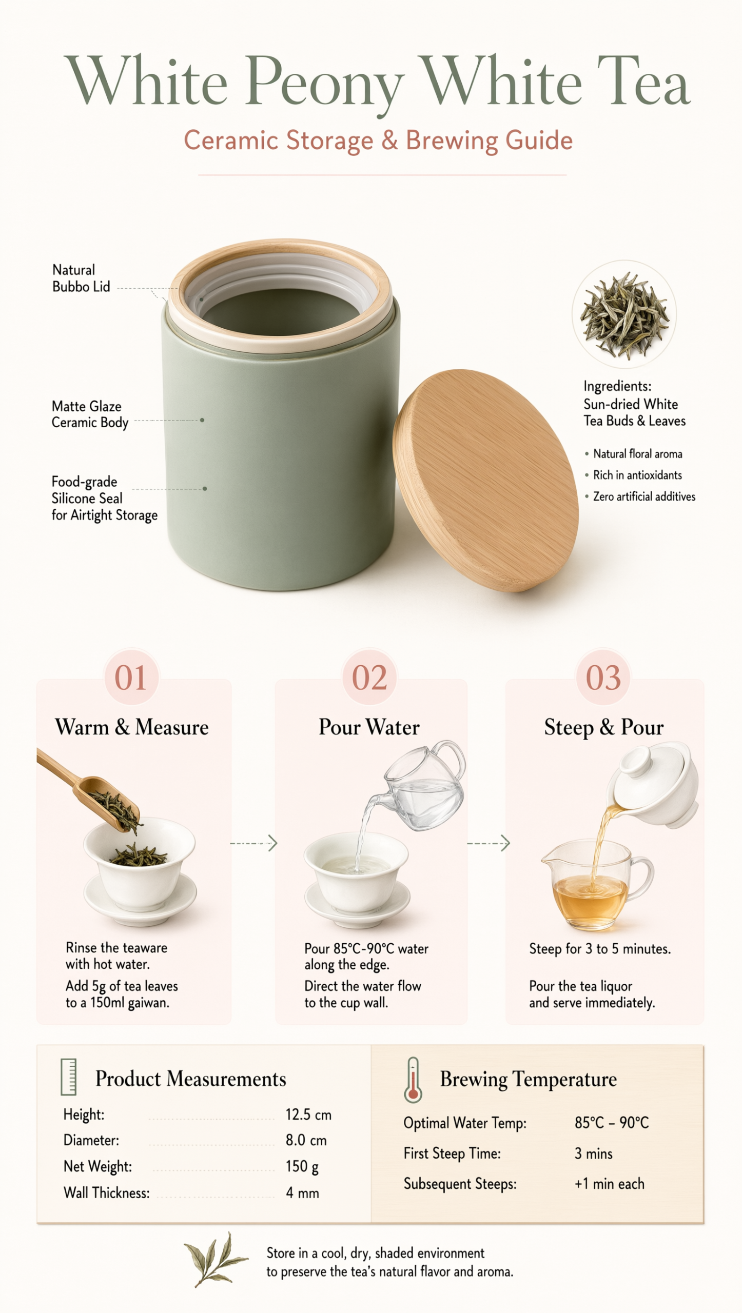
This variation shifts from street realism to clean commercial design. It still leans on the same skill: small text, neat structure, and a clear focal object. The model handles the change better when the prompt names the visual system, not just the object.
What held the layout together
- The text was treated as part of the scene, not decoration.
- Each prompt limited the number of competing subjects.
- The negative prompt blocked the usual failures: blur, gibberish, warped letters, and logos.
- The same 9:16, 2K setup worked across boards, posters, and infographics.
That is the real value of this Qwen Image 3.0 Pro prompt. It does one hard thing well: it keeps dense information readable without flattening the image. Try it on Wiro and swap the board copy for a route map, a menu, or a product spec sheet.